

In this post about the impact of browser and local machine on user’s perception of Business Central UI performance, I mentioned that Microsoft was in plan to add some new parameters in telemetry for monitoring some infrastructure’s details about clients.
An interesting parameter recently added on page views telemetry is the customDimensions.deviceHardware node:
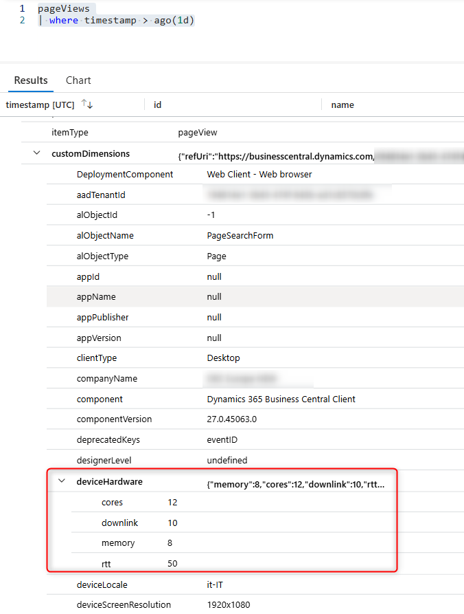
This new element contains a set of informations related to the client’s hardware, like:
- cores: number of CPU cores available.
- memory: device memory (Gb).
- downlink: network bandwidth estimate (Mb/s)
- rtt: effective round-trip time of the user’s currect connection (ms).
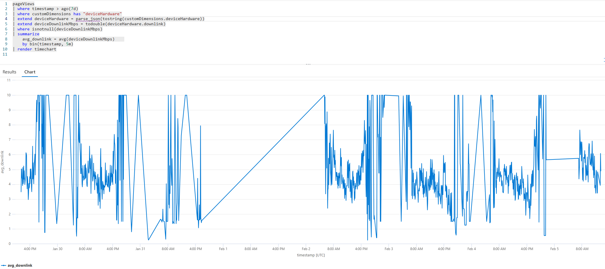
These new set of values are important to also evaluate if and how the customer’s network bandwidth is linked to some impressions of slowness of the Business Central system.
The following KQL query:
pageViews
| where timestamp > ago(7d)
| where customDimensions has "deviceHardware"
| extend deviceHardware = parse_json(tostring(customDimensions.deviceHardware))
| extend deviceDownlinkMbps = todouble(deviceHardware.downlink)
| where isnotnull(deviceDownlinkMbps)
| summarize
    avg_downlink = avg(deviceDownlinkMbps)
    by bin(timestamp, 5m)
| render timechart with (title="Average Bandwidth (Mb/s)")
gives you a time chart of the network bandwidth in a given time:
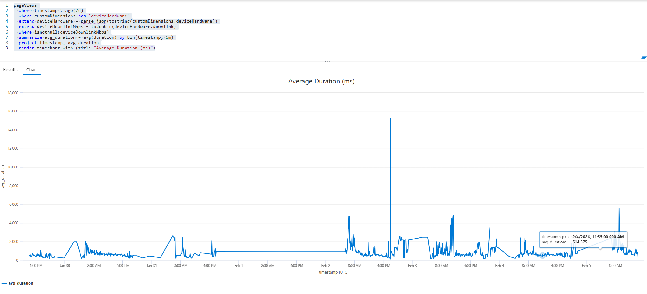
An interesting analysis is to correlate the network bandwidth with the average duration of the page views in the same time:
pageViews
| where timestamp > ago(7d)
| where customDimensions has "deviceHardware"
| extend deviceHardware = parse_json(tostring(customDimensions.deviceHardware))
| extend deviceDownlinkMbps = todouble(deviceHardware.downlink)
| where isnotnull(deviceDownlinkMbps)
| summarize avg_duration = avg(duration) by bin(timestamp, 5m)
| project timestamp, avg_duration
| render timechart with (title="Average Duration (ms)")
Here I’ve created a KQL query to compare both in the same timeline (normalized), just with the goal to visually check for possible anomalies:
pageViews
| where timestamp > ago(7d)
| where customDimensions has "deviceHardware"
| extend deviceHardware = parse_json(tostring(customDimensions.deviceHardware))
| extend
    deviceDownlinkMbps = todouble(deviceHardware.downlink),
    durationInMs = duration
| where isnotnull(deviceDownlinkMbps) and isnotnull(durationInMs)
| summarize avg_downlink = avg(deviceDownlinkMbps), avg_duration = avg(durationInMs) by bin(timestamp, 1h)
| extend _key = 1
| as T
| join kind=inner (
    T
    | summarize
        min_dl = min(avg_downlink),
        max_dl = max(avg_downlink),
        min_dur = min(avg_duration),
        max_dur = max(avg_duration)
    | extend _key = 1
) on _key
| extend
    downlink_normalized = (avg_downlink - min_dl) / iff(max_dl - min_dl > 0, max_dl - min_dl, 1.0),
    duration_normalized = (avg_duration - min_dur) / iff(max_dur - min_dur > 0, max_dur - min_dur, 1.0)
| project timestamp, downlink_normalized, duration_normalized
| render timechart with (ysplit=panels, title="Downlink vs Duration (quick view comparison)")
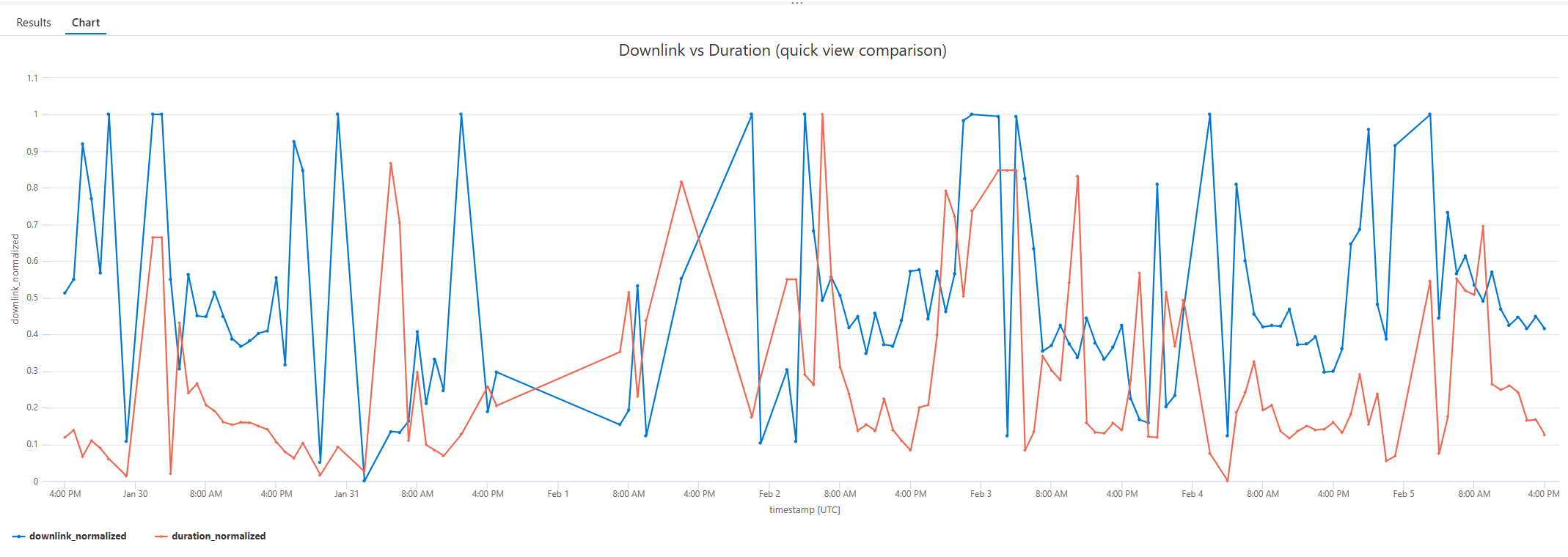
In this chart, the blue line is the bandwidth and the red line is the average page duration. Usually if we only take bandwidth into consideration, we should have short average duration when the bandwidth is high and viceversa. Otherwise, you should check your page code… 😉
These are nice new parameters that I personally suggest to insert into your monitoring strategy.
